Why Market Basket Analysis Matters for SMEs
Every time a customer checks out — in a shop, a café, or an online store — they leave behind a small piece of evidence about how your products relate to each other. Bread next to butter. Diapers next to baby wipes. Pasta next to its sauce. Most small and medium-sized enterprises collect this evidence automatically, in their point-of-sale system or e-commerce platform, and then never look at it again. It just sits there, transaction after transaction, as an unused asset.
A previous post on this blog looked at inventory optimization — turning stock data into ABC classes, reorder points, and order quantities, instead of reordering “the usual amount” by gut feel. Market Basket Analysis (MBA) is the natural companion to that: instead of asking “how much of this one item should I hold,” it asks “which items get bought together, and how strongly.” Same underlying idea — replace gut feel with a number — applied to the sales side of the business instead of the stock side.
The traditional way this gets handled at a small business is, again, gut feel: “chips and beer always go together, so let’s put them near each other,” “let’s bundle shampoo and conditioner, seems obvious.” That instinct is often right — but it only covers the handful of combinations a person happens to think of. It misses the ones that aren’t obvious: that baby wipes are bought with diapers and beer more often than chance would predict, or that a specific pasta shape quietly drags cheese sales up with it. A few hundred products and a few thousand transactions is already too much for anyone to spot those patterns by eye — but it’s a trivial amount of data for a computer to mine completely, every combination, every time.
What Market Basket Analysis actually gives you
| Benefit | Why it matters for SMEs |
|---|---|
| Increases sales through cross-selling | Reveals which products are actually bought together, so “frequently bought together” prompts and suggestions are based on evidence, not guesswork. |
| Improves product placement | Complementary items placed near each other (in-store or on a product page) capture more impulse purchases without any extra marketing spend. |
| Sharpens promotions and bundling | Bundling items that are already bought together tends to protect margin better than discounting each one individually. |
| Feeds back into inventory decisions | If a top-selling item is strongly associated with a companion product, that companion’s demand can be anticipated too — a direct link back to the reorder-point thinking in the inventory post above. |
| Personalizes marketing at no extra cost | Email or SMS campaigns can recommend the item a customer is statistically likely to want next, using data you already have. |
| Informs assortment decisions | If customers keep buying pasta but you don’t stock a matching sauce, that’s a visible, quantified gap in what you sell. |
For a small business with a limited marketing budget, the first and third rows are usually where the fastest wins are: cross-selling and bundling both use data your POS system already has, and neither requires spending a cent on advertising to test.
A practical example, using this repo’s own results
Unlike a purely hypothetical example, this repository ships with a full worked one. Its demo dataset simulates six months of a small grocery store: 3,000 transactions, 8,236 line items across 30 products, and $51,866 in total sales (an average basket of $17.29, about 2.7 items each). Running the Apriori algorithm against those 3,000 baskets surfaced 71 association rules. Here are five of them, ranked by lift:
| Products found together | Support (share of all baskets) | Confidence | Lift |
|---|---|---|---|
| Butter + Jam → Bread | 2.4% | 100% | 10.9 |
| Diapers ↔ Baby Wipes | 6.6% | 69–86%, depending on direction | 9.0 |
| Pasta ↔ Tomato Sauce | 6.0% | 65–86%, depending on direction | 9.3 |
| Bread ↔ Butter | 5.3% | 58–82%, depending on direction | 8.9 |
| Beer → Chips | 4.6% | 36–43%, depending on direction | 3.3 |
A few of these are intuitive (bread and butter), one is a little less obvious until you think about it (a parent stocking up on diapers and wipes also reaches for a beer more often than average), and all of them were found automatically, by scanning every possible combination of 30 products across 3,000 baskets — not by someone guessing which pairs to check.
The three numbers that make this trustworthy: support, confidence, lift
It’s worth understanding these three metrics, because they’re what stop this from being just “vibes with a spreadsheet attached.”
- Support — how common is this combination, across all baskets? Butter+Jam→Bread has support of 2.4%, meaning it shows up in roughly 1 in 40 baskets. Low support means a real but niche pattern; it may not be worth rearranging a shelf for.
- Confidence — of the baskets that already contain the first item(s), what fraction also contain the second? Butter+Jam→Bread has confidence of 100%: every basket in this dataset with both butter and jam also had bread. That’s the number that tells you how reliable the rule is as a prediction.
- Lift — is this association real, or just because one of the items is popular anyway? Lift compares the confidence to how often the second item shows up on its own. A lift of 10.9 means butter-and-jam baskets are almost 11 times more likely to contain bread than an average basket — a strong, genuine relationship, not a coincidence of bread being a common item.
The rule of thumb for reading the Results tab: lift above 1 means a real association, and the higher above 1, the stronger it is — but always sanity-check it against support. A lift of 20 on a combination that only appears in 3 baskets out of 3,000 is statistically real but commercially too rare to build a promotion around.
The business impact, in real numbers
Take the diapers/baby-wipes rule above. In the demo dataset, 284 of the 3,000 baskets (9.5%) contain diapers. Of those, 197 (69.4%) also contain baby wipes — but 87 diaper baskets don’t. That’s despite this being one of the strongest patterns in the entire dataset (lift 9.0): buying diapers makes buying wipes nine times more likely than chance, and yet nearly a third of diaper-buyers still walk past the wipes.
We also know the ceiling is achievable, because it already happens in the other direction: baby-wipe buyers pick up diapers 85.7% of the time. If a simple shelf placement or checkout-screen prompt closed even half that gap — nudging the diaper→wipes attach rate from 69% to around 78% — that’s roughly 23 additional wipe purchases across six months of this store’s data, worth around $115 at $4.99 a pack.
On the small scale of this demo dataset, that’s a modest number on its own. But three things make it bigger in practice:
- A real SME does more volume than this demo. Scale the transaction count up 5–10x (still a modest local shop, not a chain) and the same percentage-point improvement scales with it.
- This is one rule out of 71. Bread/butter/jam, pasta/sauce, cereal/milk, and beer/chips/salsa are all separate, simultaneous opportunities in the same dataset — the value isn’t one bundle, it’s dozens of small nudges across the whole catalog, all found from data you already have.
- The cost of acting on it is close to zero. Moving a shelf, adding a “goes well with” line on a product page, or printing a receipt suggestion doesn’t cost anything close to what a discount or an ad campaign would.
That combination — free to act on, compounding across many rules, and backed by actual transaction evidence instead of a hunch — is the real case for running this analysis at all.
What to actually do with this, this week
- Export the last 3–6 months of transactions from your POS or e-commerce platform (most systems can produce this as a CSV).
- Reshape it into one row per product per receipt (see the data schemas in the README for the exact columns), and run it through this repo’s pipeline — or a similar tool.
- Open the Results tab, sort by lift, and ignore anything with support below roughly 1–2% — too rare to act on yet.
- Pick the top 3–5 rules where the item being “pulled along” (the consequent) has a good margin, and make the pairing visible for 30 days: a shelf tag, a bundle price, a “frequently bought together” line online, or a prompt at checkout.
- Re-run the analysis next quarter. Buying patterns drift with seasons and promotions, so this isn’t a one-time exercise.
Try it yourself: a demo you can run in minutes
To make this concrete, this repository — Market-Basket-Analysis-Demo — is a small, self-contained, open-source demo. It:
- Generates (or accepts your own) retail transaction data.
- Validates that data against 20 data-quality checks — referential integrity, price consistency, duplicate detection — so bad source data gets caught with a clear report instead of silently corrupting the results.
- Mines frequent itemsets and association rules with the Apriori algorithm.
- Writes everything — inputs, validation report, and ranked rules — into a single Excel workbook.
Downloading the code (no Git experience needed)
You don’t need to know Git or the command line to get the code onto your computer:
- Go to the repository: github.com/MattProtopapas/Market-Basket-Analysis-Demo
- Click the green
<> Codebutton near the top of the page. - Click “Download ZIP” in the dropdown.
- Right-click the downloaded ZIP and choose “Extract All…“ to unzip it into a regular folder.
- Open that folder — that’s the project. Ask your AI tool of choice (I used Claude) to
set up a Python environment and install the dependencies listed in
requirements.txt— no coding experience required to get it running.
If you’re comfortable with Git,
git clone https://github.com/MattProtopapas/Market-Basket-Analysis-Demo.git does the
same thing in one step.
Running the demo
The repository includes a full README.md, but the short version, from PowerShell:
python -m venv .venv
.\.venv\Scripts\Activate.ps1
pip install -r requirements.txt

python generate_data.py      # or drop your own CSVs into data/ instead
python import_to_excel.py    # loads the data into the Excel workbook
python run_analysis.py       # validates, then mines the association rules
run_analysis.py is a gated pipeline: it only runs the analysis if every data-quality
check passes first. If your own export has issues — a price that doesn’t match the
catalog, a duplicate transaction ID, a blank field — it stops and tells you exactly which
rows to fix, rather than quietly producing rules from bad data.
Once you’re comfortable with the demo, you can point it at your own transaction export
instead of the synthetic data — the same three column schemas
(products.csv, transactions.csv, baskets.csv) are documented in the README — and
get real rules from your own sales history.
Note: the sample data shipped with this repo is synthetic and randomly generated, and this project is intended for educational and demonstration purposes only — see the repository’s Disclaimer & EULA for details. It’s a starting point for understanding how association-rule mining works, not a production merchandising system.
Understanding the results
The workbook — Market Basket Analysis Demo.xlsx — has five tabs, each one a stage of
the pipeline described above.
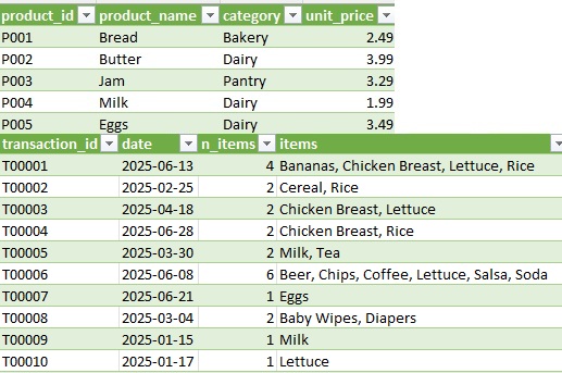
Tabs 1–3: Products, Transactions, Baskets
These are the inputs. Products is the catalog (30 items: product ID, name,
category, unit price). Transactions is the line-item detail — one row per product
per sale, 8,236 rows in the demo. Baskets is the same data reshaped one row per
transaction, with items comma-joined (Bananas, Chicken Breast, Lettuce, Rice) — this is
the actual input the analysis reads.
Tab 4: Data Quality
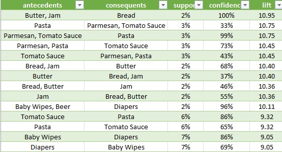
Before any rule is mined, the pipeline runs 20 checks — is every product ID unique, does every transaction’s price match the catalog, does every basket’s item list agree with the transaction detail, are there duplicates — and writes a pass/fail report with example offending rows for anything that fails. In the demo data, all 20 checks pass; on a real export, this tab is usually where the first useful finding shows up, because messy source data is far more common than people expect.
Tab 5: Results
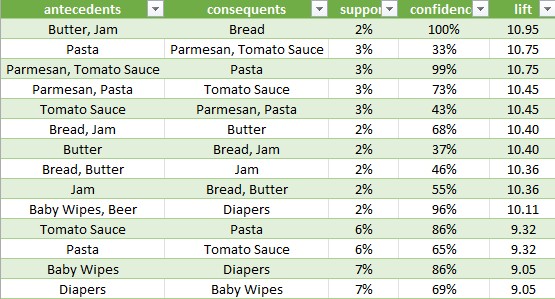
This is the payoff: every association rule found, sorted by lift, with support and confidence alongside it. Reading the top row from the demo — Butter, Jam → Bread, support 2.4%, confidence 100%, lift 10.9 — means this exact combination shows up in 1 of every 40 baskets, every basket with both butter and jam also had bread, and bread is almost 11 times more likely to appear alongside butter-and-jam than in an average basket. That’s a rule worth acting on; a rule with support of 0.1% and no clear business rationale, even with a high lift, usually isn’t.
The limits worth keeping in mind
Market Basket Analysis, like the inventory formulas in the earlier post, is a genuinely useful tool with real limits:
- It shows association, not causation — it tells you what tends to appear together, not why.
- It needs reasonably clean transaction data, which is exactly what the Data Quality tab exists to catch before it quietly skews the results.
- It works best with real transaction volume; a handful of sales won’t produce reliable patterns.
- It reflects the past — a strong rule from last year’s holiday season may not hold this year if buying habits, suppliers, or the product range have changed, so it’s worth re-running periodically rather than treating one report as permanent.
None of that makes the exercise less worthwhile. It just means the output is an input to a merchandising or marketing decision, not the decision itself — in the same way the inventory post’s ABC classes and reorder points are inputs to a purchasing decision, not a replacement for judgment. Used that way, on data a small business already collects through its point-of-sale system, Market Basket Analysis is one of the lowest-cost ways available to turn “we think these sell well together” into “we know these sell well together, and by how much.”