Every production line generates measurements. A filling line weighs bottles, a packaging line counts rejects, a machining cell logs dimensions. Most small manufacturers collect those numbers — an operator writes them on a check sheet, or the machine logs them to a CSV nobody opens — and then use them exactly once: to ask “is this unit within spec, yes or no?” The far more valuable question those same numbers can answer goes unasked: is the process itself behaving normally, or has something changed?
Previous posts on this blog have made the same argument for stock reordering, cross-selling, and working capital: replace gut feel with a number, using data the business already collects. Lean Six Sigma’s statistical process control (SPC) toolkit does exactly that for production quality. Control charts tell you when the process changed and roughly when to go look for the cause; a capability study tells you whether the process, even on its best behavior, is actually good enough to meet the customer’s specification. Neither requires new sensors, new software licenses, or a consultant — just the measurements the line is already producing, and about a century of well-established statistics (the control chart dates to Walter Shewhart at Bell Labs, 1924).
The traditional way this gets handled at a small plant is reactive: run the line, inspect what comes off it, scrap or rework the failures, and investigate only when a customer complains. That approach has two expensive blind spots. First, inspection only catches units that are already bad — by the time rejects appear, hours or days of drifting production are already in boxes. Second, it can’t distinguish a process having a normal day from a process that has genuinely shifted, so teams either over-react (adjusting a machine that was fine, which adds variation) or under-react (missing a real drift because “the numbers always bounce around a bit”).
What SPC and a capability study actually give you
| Benefit | Why it matters for a small manufacturer |
|---|---|
| Catches process shifts the day they happen | A control chart flags the shift in the measurements, hours or days before it shows up as customer-visible defects — while the cause (a worn part, a bad batch of material, a setup error) is still fresh and findable. |
| Stops both over- and under-reaction | Statistically derived control limits separate normal run-to-run noise from a real change. No more tweaking a machine that was fine — a practice that famously makes output worse — and no more explaining away a genuine drift. |
| Puts a number on “is the process good enough?” | Cp and Cpk compare the process’s actual spread against the customer’s spec limits. A Cpk below ~1.33 says the odd out-of-spec unit is a system problem — no amount of operator vigilance will inspect it away. |
| Quantifies quality in money-adjacent units | DPMO (defects per million opportunities) and the sigma level turn “we have some rejects” into a rate you can cost, track over time, and compare across lines or against an improvement target. |
| Reveals hidden giveaway | A filler drifting high passes every spec check while silently giving product away in every unit. The X-bar chart sees it; per-unit inspection never will. |
| Bad data never reaches the analysis | A validation layer rejects unreadable weights, blank operator fields, and duplicate unit IDs with a stated reason — so the charts are computed from measurements you can trust. |
A practical example, using this repo’s own results
This repository — lean-six-sigma-demo — ships with a full worked example. The scenario is a small bottling company whose filling line targets 500 g per bottle, with a customer specification of ±6 g (so 494–506 g). Every hour, a subgroup of 5 bottles is pulled off the line, weighed, and visually inspected; the demo simulates 20 production days of this — 501 raw measurement rows. To make it realistic, the data generator deliberately corrupts a few rows (an unreadable weight, a blank operator name, a duplicate unit ID) and, more importantly, injects a special cause on one production day: the filler drifts about 3 g high and the visual defect rate jumps.
The pipeline’s validation step rejected 26 of the 501 rows (5.2%) with a stated reason for each, leaving 475 trustworthy measurements. Running the SPC study on those produced the classic Six Sigma picture — and it caught the injected problem exactly where it was planted:
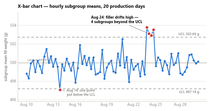
The X-bar chart plots each hourly subgroup’s mean against control limits computed
from the process’s own history (X̿ ± A2 × R̄ — here a center line of 499.91 g with
limits at 497.14 g and 502.69 g). For thirteen days the process bounces around inside
the limits — that’s normal variation, and the correct response to it is to leave the
machine alone. Then on August 24, four subgroup means land between 502.9 g and
503.8 g — all beyond the upper control limit. That’s not a bad day; that’s a
different process. Someone should walk to the filler that morning.
Here’s the part worth pausing on: almost every bottle filled during that drift still passed the ±6 g spec. A bottle at 503.5 g is comfortably inside 494–506. A plant relying on spec-checking alone would have shipped that entire day without a single alarm, while giving away roughly 3.5 g of product in every bottle. The control chart flags it immediately, precisely because it asks “has the process changed?” rather than “is this bottle acceptable?”
The visual inspection data tells the same story from a second angle:
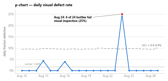
The p-chart tracks the daily fraction of bottles failing visual inspection
against its own control limits (p̄ ± 3√(p̄(1−p̄)/n)). The baseline defect rate is
1.68%, and a day at 4% stays under the ~9.5% upper limit — noise, not news. But on
August 24, 6 of 24 inspected bottles failed (25%), nearly three times the limit.
Two independent charts flagging the same day is exactly the kind of converging
evidence that turns “the line seems off lately” into “go look at the filler, it
changed on the 24th.”
The deeper finding: in control is not the same as capable
The third piece of the study asks a different question. Suppose the special cause is found and fixed — is the process, running normally, actually good enough for the ±6 g spec?
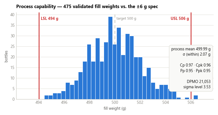
The capability study says: almost, but no. The process mean sits at 499.99 g — beautifully centered on the 500 g target — but the within-subgroup sigma estimate is 2.07 g, giving Cp = 0.97 and Cpk = 0.96. A Cp of exactly 1.0 would mean the process’s natural ±3σ spread just barely fits inside the spec; the usual minimum demanded of a supplier is 1.33, which leaves margin for the small drifts every real process has. At 0.97, this line’s natural spread (about ±6.2 g) is slightly wider than the ±6 g the customer allows — so even perfectly centered and perfectly in control, it will ship the occasional out-of-spec bottle as a matter of mathematics.
Across the demo dataset that shows up as 10 defective bottles out of 475 (2 out of spec on weight, 8 visual failures), a DPMO of 21,053, and a sigma level of 3.53 — respectable, typical of decent small-scale manufacturing, and a long way from the 3.4-defects-per-million ideal that gives Six Sigma its name.
This distinction — in control versus capable — is the single most useful idea in the whole toolkit, because the two problems have different owners and different fixes:
- An out-of-control signal (August 24) is a special cause: something specific and findable — a worn seal, a miscalibrated fill head, a new material lot. The operator or line lead can usually hunt it down, and the chart tells them when it started.
- A capability shortfall (Cpk 0.96) is a common cause problem: the process as designed simply varies too much. No operator can fix that by paying more attention — it takes a management decision: maintenance or upgrade of the filler, better upstream material consistency, or renegotiating the spec. Blaming the crew for it is both unfair and useless, and the capability study is what proves that.
The business impact, in real numbers
Put the two findings side by side and cost them:
- The drift. On August 24 the filler ran about 3.3 g high. On the demo’s toy scale that’s trivial — but a real line filling even 10,000 bottles a day gives away 33 kg of product per day at that drift, invisibly, since nearly every bottle still passes spec. A control chart catching that on day one instead of at month-end stocktake pays for the entire exercise by itself. (And the same chart protects in the other direction: a low drift is a compliance problem, since selling underweight product is regulated in most markets.)
- The capability gap. A DPMO of 21,053 means roughly 2.1% of production is defective in the long run. For a plant shipping €1M a year of product, that’s on the order of €21k in scrap, rework, and returns — before counting the customer relationships that quietly erode when defects reach them. The capability study converts that from a vague annoyance into a numbered business case for a specific investment: getting Cpk from 0.96 to 1.33 has a calculable payback.
- The data quality dividend. 5.2% of the raw measurement rows were unusable — and every one was caught, logged with a reason, and kept out of the analysis. Anyone who has watched a decision get made on a spreadsheet with silently broken rows knows what that’s worth.
What to actually do with this, this week
- Pick one measurement on one line — a weight, a dimension, a daily reject count. Don’t boil the ocean.
- Collect it in small subgroups at a regular interval (the classic recipe: 4–5 consecutive units, every hour) for at least 20 subgroups. If it’s already being logged, export what you have.
- Run it through this repo’s pipeline (below) or any SPC tool: X-bar/R chart for the measurement, p-chart for the reject rate, Cp/Cpk against your customer’s spec.
- Act on the two outputs differently: out-of-control points get a same-day walk-to-the-machine investigation; a low Cpk goes on the management agenda as an investment decision, with the DPMO number attached.
- Keep the chart running. Its whole value is in flagging the next shift on the day it happens — and in restraining everyone from adjusting a process that the chart says is fine.
Try it yourself: a demo you can run in minutes
To make this concrete, lean-six-sigma-demo is a small, self-contained, open-source pipeline. It:
- Generates a fake bottle-level measurement dataset (fill weight, visual inspection result, machine, operator, batch) — with deliberate data errors and an injected special cause, so the downstream tools have something real to catch.
- Validates every row against a strict schema and writes a rejection report, so bad source data is caught with a stated reason instead of silently skewing the charts.
- Computes the X-bar/R charts, the p-chart, the out-of-control signals, and the full capability study (Cp/Cpk, Pp/Ppk, DPMO, sigma level), and writes everything into a single Excel workbook — with live, editable Excel charts, not pasted images.
Downloading the code (no Git experience needed)
You don’t need to know Git or the command line to get the code onto your computer:
- Go to the repository: github.com/MattProtopapas/lean-six-sigma-demo
- Click the green
<> Codebutton near the top of the page. - Click “Download ZIP” in the dropdown.
- Right-click the downloaded ZIP and choose “Extract All…“ to unzip it into a regular folder.
- Open that folder — that’s the project. Ask your AI tool of choice (I used Claude)
to set up a Python environment and install the dependencies listed in
requirements.txt— no coding experience required to get it running.
If you’re comfortable with Git,
git clone https://github.com/MattProtopapas/lean-six-sigma-demo.git does the same
thing in one step.
Running the demo
The repository includes a full README.md, but the short version, from PowerShell
(requires Python 3.10+; no numpy, pandas, or scipy needed):
python -m venv .venv
.\.venv\Scripts\Activate.ps1
pip install -r requirements.txt

python generate_data.py --seed 42   # step 1: fake measurements, with planted problems
python validate_data.py             # step 2: schema-check every row, reject the bad ones
python analyze_process.py           # step 3: control charts + capability -> Excel
Then open output/spc_analysis.xlsx.
The generator takes options worth playing with: --drift 0 produces a process that
stays in control (nice for seeing what “boring and healthy” looks like),
--error-rate 0 produces a perfectly clean dataset, and --days,
--samples-per-day, and --subgroup-size change the sampling plan. Every script
also accepts custom input/output paths — so once you’re comfortable with the demo,
you can drop your own real measurement CSV (matching the columns in
sixsigma_common.py) into data/, skip the generator entirely, and run
validate_data.py + analyze_process.py straight on your own line’s numbers.
Note: the sample data shipped with this repo is synthetic and randomly generated, and this project is intended for educational and demonstration purposes only — see the repository’s Disclaimer & EULA for details. It’s a starting point for understanding how SPC works, not a validated production quality system.
Understanding the results
The workbook — output/spc_analysis.xlsx — has four sheets, one per stage of the
study:
Sheet 1: Input Data. The 475 validated measurements the analysis actually ran on,
one row per bottle, with out-of-spec or visually defective bottles highlighted.
Alongside it, data/validation_report.txt lists every rejected row and why — in the
demo run, 26 rows: unreadable or non-positive weights, uninterpretable inspection
flags, blank operators, invalid subgroup numbers, and one duplicate unit ID.
Sheet 2: X-bar & R. Per-subgroup means and ranges with their control limits and signal flags, plus the two live control charts. The X-bar chart watches the process center (it’s the one that caught the August 24 drift); the R chart watches the process spread, and stayed quiet throughout — which is itself information: the filler drifted high, but it didn’t get less consistent. Subgroups left incomplete by validation rejections are excluded here (fixed-size SPC constants assume a constant subgroup size), which is why 78 of the 100 subgroups appear.
Sheet 3: P Chart. Daily defect proportions with their variable control limits and signal flags, plus the live chart — the August 24 spike to 25% is flagged as beyond limits.
Sheet 4: Capability. The process mean, both sigma estimates (within-subgroup via
R̄/d2, and overall), Cp/Cpk/Pp/Ppk color-coded against the usual thresholds, the
defect counts, DPMO, and the sigma level. This is the sheet to bring to a management
meeting: it’s the one that says whether the process needs fixing (special causes)
or investment (capability).
The limits worth keeping in mind
SPC, like every tool covered on this blog, is genuinely useful within real limits:
- A control chart detects that the process changed and when — never why. The investigation still belongs to the people who know the machine.
- Control limits computed from a period containing a special cause are slightly inflated by it. Standard practice is to establish limits from a known-good baseline period, then monitor against them; the demo computes everything from one window for simplicity.
- The X-bar/R constants assume small subgroups of equal size and roughly normal subgroup means; Cp/Cpk assume approximate normality too. Heavily skewed processes need transformed or different charts.
- Twenty days of data gives usable limits, but capability indices firm up with more history — treat an early Cpk as an estimate, not a verdict.
- And the classic Six Sigma caveat: the sigma level’s conventional 1.5 σ shift is a modeling convention, not a law of nature. Use DPMO to track improvement, not to win arguments about decimal places.
None of that diminishes the core value. For a small manufacturer, the measurements are already being taken; the statistics have been settled for a hundred years; and the software — as this demo shows — fits in three short Python scripts and an Excel file. What SPC changes is the question the plant asks every day: from “did we ship anything bad?” — answerable only after the fact — to “is the process still the same process?” — answerable the same hour something changes, while the fix is still cheap.